
The Simple Trade
The power of the MDI (Market Dashboard Index)
Last week, several readers asked whether we also provide a time series for our new flagship Market Dashboard.
👉 The answer is yes.
We call it the MDI – Market Dashboard Index.
You can find the post here:
https://reflectionsofreality.substack.com/p/market-dashboard-as-a-time-series
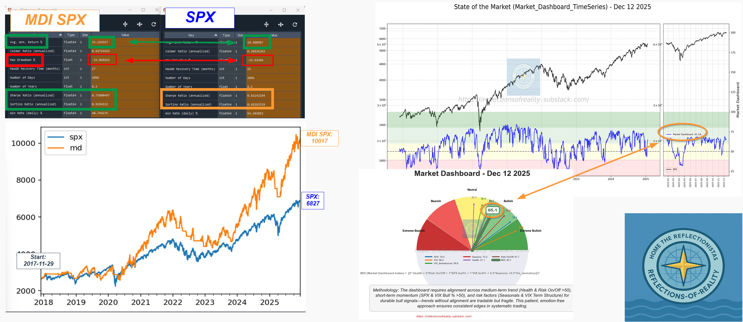
This week, we want to showcase the power of the Market Dashboard and explain why it is the very first thing we look at at the beginning of each trading day.
A Simple Experiment
Let’s keep things deliberately simple:
We go long and stay long whenever the MDI > 50
Since our analysis is based on end-of-day data, we enter and exit at the next day’s open after a signal
To compare apples with apples, we apply leverage so that the maximum drawdown of the MDI strategy matches the maximum drawdown of a long-only S&P 500 strategy over the same period
The idea is straightforward:
➡️ Both strategies take the same amount of risk
➡️ One uses price only (SPX long-only)
➡️ The other uses Market Dashboard Index (MDI)
Results
Over the test period:
Buying 1 unit of SPX on 2017-11-29 results in a portfolio value of 6,827
Using the MDI strategy results in a portfolio value of 10,017
Average annual return:
MDI strategy: ~33%
SPX long-only: ~19%
Sharpe and Sortino ratios also clearly favor the MDI strategy, indicating superior risk-adjusted performance
Conclusion
This is not about over-engineering.
It’s not about prediction.
It’s about context.
The MDI gives us a clear, actionable market regime signal, and when risk is normalized, it materially improves outcomes.